
Sturdy Statistics also specializes in low-data,
explainable, text-classification.
In addition to our signature text analysis API, Sturdy Statistics also provides a text classification API. Our proprietary classification algorithms excel precisely where most other classification models struggle: classifying long documents, with multiple categories, and few labeled examples. While these important aspects aren’t often emphasized in machine learning research, in our experience they are fundamental to the practical application of machine learning.
Technology Comparison
The figure below compares learning curves for four different document classification technologies. The learning curve for a machine learning model demonstrates how the model’s performance improves as it trains on more data; in effect, it shows how well the machine learning model actually “learns.” In this study, we have chosen the ROC AUC score to measure model performance. This score is a good measure to compare classification performance across different model technologies and across different datasets. An AUC score of 50% corresponds to random, uninformed predictions, while a score of 100% corresponds to perfect classification.
In this plot, the two blue lines show Sturdy Stats models: we show our primary model with a solid line, and our experimental model with a dashed line. The red line shows a BERT model trained by Google1 and fine-tuned on our dataset, and the gold curve shows a traditional baseline known as “bag of words” logistic regression. Though logistic regression is a simple model by current standards, it is surprisingly difficult to beat in long-text classification.2
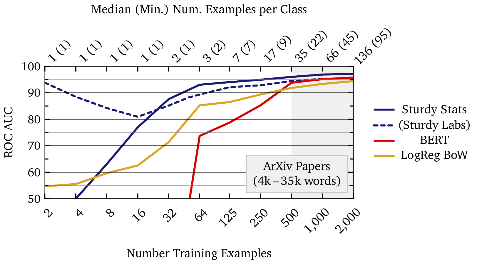
The x-axis of the plot shows the total amount of labeled data used to train a model, and each point on each curve represents a different model trained with that quantity of data. Note that the x-axis is on a logarithmic scale; each successive tick corresponds to a doubling of the dataset size. Since acquiring data is usually the most expensive and most time-consuming aspect of applied machine learning, each successive tick on the x-axis also roughly doubles the cost of the model. The plot therefore spans a wide range of models, from cheap models that anyone could curate, to large ones requiring significant investment and maintenance.
We have shaded the region beyond 500 labeled data points because we consider that to be a practical limit for real-world machine learning. In our experience, it is difficult to get a single person to label 500 text examples. Thus, training models with more than 500 data points typically requires outsourcing data labeling, which then introduces errors and inconsistency into the data… which then requires time-consuming and expensive follow-up to correct the data. Such troubles can bring machine-learning deployment to a halt. It is therefore extremely beneficial to work with AI technology which can operate with fewer than 500, and ideally fewer than 100, labeled training examples. This enables a single, dedicated stakeholder to label the data, ensuring its accuracy and fidelity to the task at hand. It also enables purpose-built models to be developed and deployed quickly as needs arise, thus taking full advantage of the automation that is possible with AI.
In this example, the Sturdy Stats models perform at an AUC of 90% with just a few dozen examples; a single person could curate such a dataset in under an hour. On the other hand, the BERT and logistic regression models require roughly ten times as much data (∼500 examples) to reach the same performance. Large, purpose-built datasets are time-consuming and expensive to curate; in our experience, data availability is the limiting factor for most industrial machine learning applications. Using an AI technology which can operate with 1/10th as much data provides a tremendous competitive advantage.
From Research to Reality: The Shifting Nature of Machine Learning Tasks
It is worth emphasizing just how little data some of the Sturdy Stats models trained on in the above plot. Due to the extremely small dataset sizes shown above, the learning curves exhibit behavior you may not have seen previously. (Most published learning curves begin at a few hundred, or even a few thousand, training examples.)
The data in this example are academic papers posted to ArXiv, downloaded and processed using Andrej Karpathy’s “ArXiv Sanity” program (the dataset is described here). When uploading each paper, the authors select the primary academic discipline that the paper should be filed under; the classification task is to predict this discipline based only on the content of the paper. Our dataset includes twelve such disciplines, all related to computer science or machine learning.
Machine learning research often relies on carefully curated datasets and experimental setups that differ significantly from how data is collected and used in practice, leading to models that underperform in real-world scenarios. To address this, we structured our test to reflect real-world usage. Our test is, therefore, somewhat atypical. We sorted the papers in our dataset by the MD5 hash of their content to create an effectively random yet easily reproducible ordering. From this sorted list, the first Ntrain examples were selected to construct training sets of varying sizes. Each dataset therefore grows progressively, retaining all previously included examples, with new data arriving in random order, i.i.d. from the population. This mirrors the incremental nature of real-world data curation. In practical applications, data is typically added as it becomes available, without the stratification, tranching, or meticulous curation often employed in machine learning research. By designing our test to reflect these real-world conditions, we aim to better evaluate how models perform in practical, evolving scenarios rather than in idealized experimental settings.
When we make our smallest dataset with only two labeled examples, only two classes are present: we have one paper from math.AC (Commutative Algebra) and one from cs.NE (Neural and Evolutionary Computer Science). We therefore have just one example per class, which is noted on the top axis of the plot. When we grow the dataset to four examples, a new class emerges: one of the new papers is from cs.PL (Programming Languages). Even though we have doubled the dataset size, the problem becomes more challenging, with three classes instead of just two. And we still have only one example per class on average! Rather than simply providing more information for the model to learn from, adding data has also expanded the problem: in effect, as we move toward the goal post, we obtain a clearer view of it and realize that the goal post is actually a bit further away than we had realized. Even with a dataset size of 32, eight times larger, half of the classes still only have one labeled example.
This effect, where the problem becomes more challenging as you collect more data because new distinctions and subtleties emerge, is very characteristic of real-world machine learning. You rarely begin a machine learning project with perfect knowledge about its goals; instead, as you work toward automating a task, you learn more and more about the subtleties and difficulties of the task. You find that the task is somewhat more difficult than, or at least somewhat different from, what you had originally expected. Consequently, the final specification of a machine learning model may bear little resemblance to the initial idea. With some workflows — such as active learning or human-in-the-loop training — this process plays out in real time! Most machine learning studies, however – with a fixed label scheme and a fixed test set – do not capture this effect. This is one of the reasons that machine learning often looks better “on paper” than in practice, and it is why we have endeavored to make this evaluation as realistic as possible.
(Incidentally, this is why the experimental “Sturdy Labs” model initially has a negative slope to its learning curve: even though we are providing more data initially, we aren’t providing more data per class. And at the same time, the classification problem becomes more difficult with added classes and more subtle distinctions [for example, math.AC and math.GR have much more in common with each other than do the original two classes math.AC and cs.NE]. The slope changes sign after N=16 training examples, after which we begin to collect multiple examples of each class. This effect is only visible with the Sturdy Labs model because it is the only model which performs well with fewer than 10 examples.)
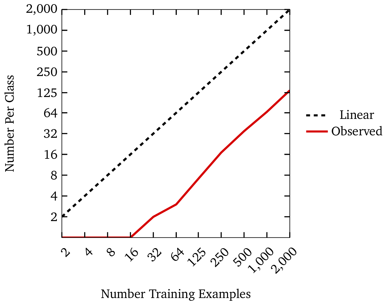
We note this effect of new classes in the learning curve plot above: while the bottom axis of the plot shows the total number of labeled data points (and thus the effective cost of training the model), the top axis shows the median (and minimum) number of data points per label. This axis more closely indicates how much information is being fed to the model. You can see that the Sturdy Stats models can perform with just one or two examples per class; the BERT model on the other hand requires approximately 20 – 30 labeled examples per class. This again shows the ∼10× efficiency factor of Sturdy Stats classifiers.
You can also see that the number of labels per class (which affects quality) grows much more slowly than the total number of labels (which affects cost). The next plot shows this relationship graphically. The fact that cost grows so much more quickly than quality is another reason why machine-learning solutions often look better on paper than they do in practice.
Explainability
One of the most distinctive features of our classification models is their fundamental explainability: users of Sturdy Stats models are able to understand precisely how a model arrives at each specific prediction. This is extremely unusual in text classification, except for the simplest models such as logistic regression; typically, AI “explainability” involves significant post-processing and interpretation of the prediction, very often using another (and usually opaque) AI model to aid in the analysis. The extreme transparency of Sturdy Stats models builds trust with users, and might even be required in sensitive applications like legal, medical, or financial decision-making, where incorrect or biased classifications have significant consequences. However, if you provide machine-learning results to end users, there may be an even more important reason to feature this explainability.
In a research study from Wharton, Dietvorst et al. (2014)3 investigate an interesting phenomenon they call “algorithm aversion.” In their careful research, Dietvorst et al. found that, when users are only exposed to the predictions made by an algorithm, and not its underlying reasoning, users have unrealistic expectations for the model’s performance. Because of this unrealistic expectation, when users see the model err, users quickly (and irrationally) lose confidence in the model, even when doing so significantly disadvantages them. If users don’t understand how a model works, or why it made the prediction, all they can see is that the model was wrong. The authors conclude “People are more likely to abandon an algorithm than a human judge for making the same mistake. This is enormously problematic, as it is a barrier to adopting superior approaches to a wide range of important tasks.” But the authors also note that “people may be more likely to use algorithms that are transparent.” In our experience with end users of AI products, this is precisely the case.
The example below shows the explanation of a correct prediction from our model. The input document was a patent description, and the classification task is to predict the category (known as the CPC code) for the patent (see here for more about this dataset and model). In this case, our model correctly predicted that the patent belongs in the “construction” category. We can inspect which sentences, and which words within those sentences, most contributed to the prediction. The figure below shows that 7 out of 159 sentences in the description contributed more than 50% of the information used to make the prediction; interestingly, most of these are contiguous, and center on the “SUMMARY OF THE INVENTION” section heading. Thus, we can see that the model has indeed identified the “right” portions of the document to analyze. (At least, it chose the same part of the document that I would have checked if given this task.) We can also see that the words well, wellbore, casing, drilling, bonding, adhesion, cement, cementing, and somewhat surprisingly, current4 contributed appreciably to the prediction, whereas words like pressure and temperature do not. This makes sense in light of the fact that other patent categories, such as “Physics” or “Engineering” might also uses these terms. The words wellbore and cement are more specific to construction. These results show that the model has not only made a correct prediction, but that it has done so for appropriate and understandable reasons.
In addition to explaining the prediction, the above example serves as an extractive summary of the original document, consisting of a few exact quotes which are most relevant to its categorization. If desired, you can send this to an LLM for an abstractive, rather than extractive summary. We queried ChatGPT with the following prompt “Based on the following key sentences extracted from a patent description, please summarize what the patent is about. Be as concise as possible, answering in no more than a short paragraph” and obtained:
The patent describes a method for improving wellbore sealing and bonding using adhesive thermoplastic resins. These resins are incorporated into drilling fluids, spotting fluids, and cement slurries, and applied to well components such as casings. When the temperature in the wellbore exceeds the resin’s melting point, it enhances the adhesion and sealing properties, making the well more resistant to damage from thermal and pressure changes. This approach addresses limitations in conventional well cementing methods by improving ductility, bonding, and overall sealing effectiveness.
In this example, sending only the most relevant sentences, rather than the entire document, resulted in a shorter and more focused summary, along with a 95% cost savings.
Inspecting An Incorrect Prediction
We have seen that model explainability can be incredibly useful, even when the model is correct. However, as suggested by Dietvorst et al. (2014), the explainability feature is even more useful in cases where the classification model makes mistakes. When users only see the prediction from an algorithm, and see that the prediction is wrong, they rapidly lose confidence in the algorithm. As a result, users abandon well-performing algorithms in favor of manual review, even when it entails significant cost; indeed, we have seen this play out many times in our industry experience. However, we have found that when users can see why a model makes mistakes, it instead builds trust in the model, even when the model is wrong. Users who can see why a model was incorrect assess such models more like the human judges in the Dietvorst study, with more realistic expectations and a more accurate assessment of performance. Explainability is the cure to algorithm aversion.
In the example below, we see a patent description which the patent office classified as “General,” but which our model incorrectly classified as pertaining to “Textiles.” By inspecting the sentences flagged by the model, we see that the model highlighted the terms nonwoven webs of fibres, wet spinning techniques, and drug-releasing fabrics. We even see the “textile industry” explicitly mentioned! Thus we can see that, even though the model was incorrect, it is picking out and highlighting very relevant information in the document. We can also see that there is some ambiguity in the categorization: even though the patent office has to put a patent into just a single category for filing purposes, an invention may touch on multiple domains. This is a very different error than if the model had predicted an unrelated category of, say “Transportation” or “Electricity.”
Expanded Learning Curve Comparison
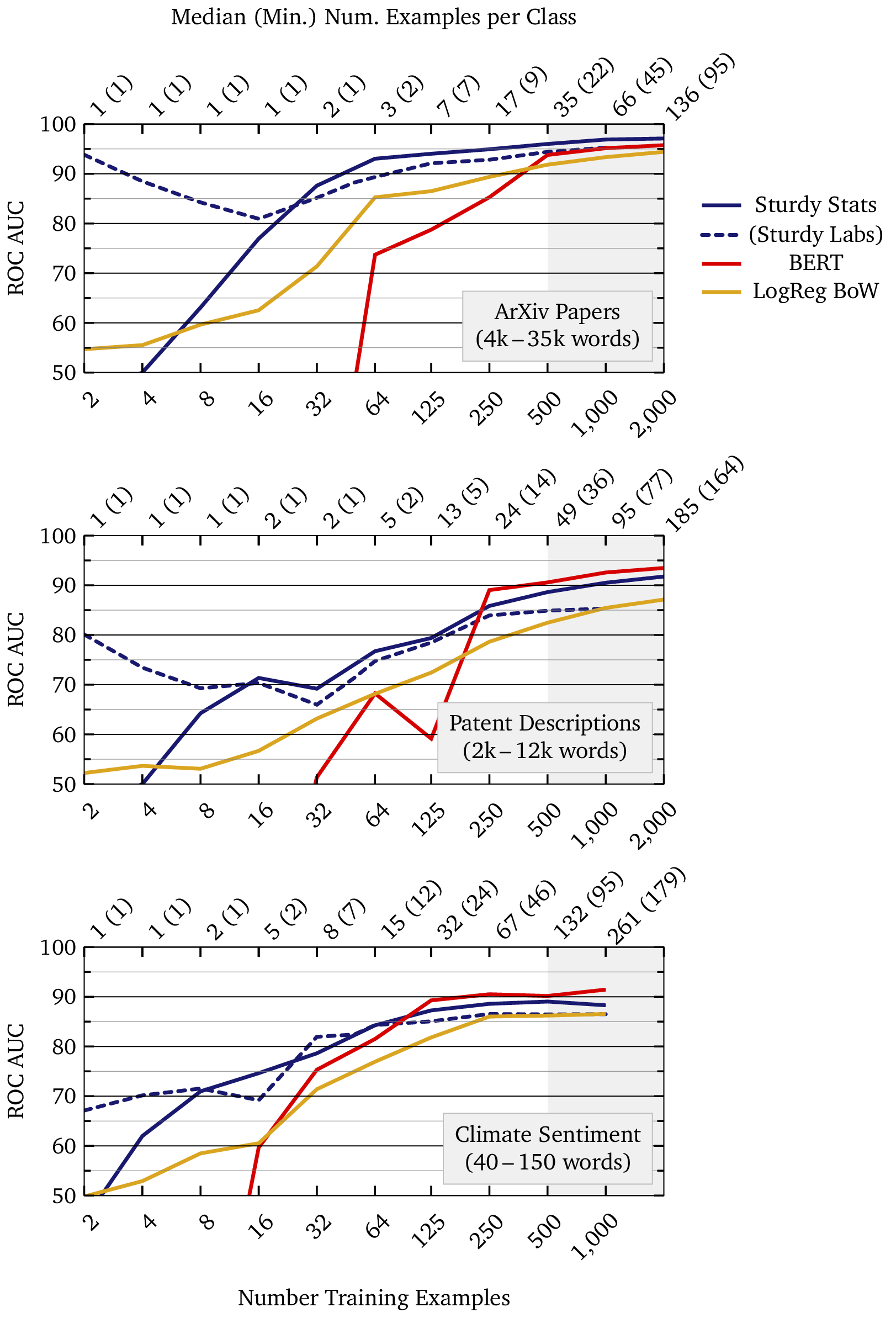
This section expands upon the technology comparison section above by showing results from multiple datasets. Here we provide more information about the datasets, and we expand the analysis to show datasets which are more challenging for the Sturdy Stats models.
Datasets
ArXiv Classification
Each entry is a full-length ArXiv paper downloaded and converted to text via utilities from the ArXiv sanity program. When authors submit each manuscript to ArXiv, they select a primary academic discipline for the paper; the classification task is to predict this discipline based only on the content of the paper. We downloaded the dataset with the “no-ref” option; this removes explicit references to the categories from the text (which often appear in, e.g. bibliographies). The twelve categories are:
| cs.AI | Artificial Intelligence |
| cs.CE | Computational Engineering |
| cs.CV | Computer Vision |
| cs.DS | Data Structures |
| cs.IT | Information Theory |
| cs.NE | Neural and Evolutionary |
| cs.PL | Programming Languages |
| cs.SY | Systems and Control |
| math.AC | Commutative Algebra |
| math.GR | Group Theory |
| math.ST | Statistics Theory |
| stat.ML | Machine Learning |
We sorted the papers by the MD5 hash of their content to obtain a reproducible, but effectively random, ordering of the documents. A dataset of size Ntrain consists of the first Ntrain documents in this ordering. This is a challenging dataset due to the document length (up to 35,000 tokens, in 1,200 sentences), but is otherwise the easiest classification task in our test, due to the relatively clear class boundaries.
Big Patent
The “Big Patent” dataset, consisting of 1.3 million of U.S. patent documents, was assembled to Google for training their language models. Each patent application is filed under a Cooperative Patent Classification (CPC) code. The classification task is to predict this CPC code for a patent, based only on the content of its description. There are nine such classification categories:
| A | Human Necessities |
| B | Performing Operations; Transporting |
| C | Chemistry; Metallurgy |
| D | Textiles; Paper |
| E | Fixed Constructions |
| F | Mechanical Engineering; Lightning; Heating; Weapons; Blasting |
| G | Physics |
| H | Electricity |
| Y | General |
This is a difficult classification task because the categories are ambiguous; for example, many patent descriptions could fit equally well under “physics” or “electricity.” Despite the difficulty of the task, BERT performs considerably better here than on the ostensibly easier task of classifying research papers. It is worth noting that this dataset was produced by Google for training their large language models; as a result, it seems possible that BERT was actually trained on this data as part of its pre-training. If that is indeed the case, this test would not accurately measure BERT’s performance for this task.
Climate Sentiment
Each entry in this dataset consists of a few sentences (typically 40-150 words) related to climate change. The entries are excerpted from corporate disclosure documents from various sources. Each entry is tagged into one of three classes: risk, neutral, and opportunity.
In their benchmark study of text classification, Reusens et al. (2024) find that “The sentiment analysis tasks prefer more complex methods.” Consequently, pre-trained generative models such as BERT should be expected to do especially well at this task, while simpler models such as logistic regression are disadvantaged. Though this is a very different task than long-text classification, the Study Stats models still perform well.
Learning Curves
Notes
1 Specifically, we use the BERT-Medium from Turc et al. (2019) trained using pre-trained distillation, as we found that this model generalized slightly better than BERT-base or BERT-large when fine-tuned on the very small datasets shown in our test. In our testing, we also found that freezing the embedding layer in the model led to better classification performance, especially on small datasets. This model has 25M trainable parameters out of 42M total.
Turc, I., Chang, M.-W., Lee, K., & Toutanova, K. (2019). Well-read students learn better: On the importance of pre-training compact models. arXiv. https://arxiv.org/abs/1908.08962
2 See Reusens et al. (2024) for a careful and thorough study comparing different text classification algorithms. Among other things, the authors conclude that:
- Overall, Bidirectional LSTMs (BiLSTMs) are the best-performing method.
- LR with TF-IDF shows statistically similar results to BiLSTM and RoBERTa.
- Smallest datasets prefer less complex techniques.
We would argue that what Reusens et al. refer to as a “small” dataset is in fact larger than many datasets used in real-world applications of machine learning.
Reusens, M., Stevens, A., Tonglet, J., De Smedt, J., Verbeke, W., vanden Broucke, S., & Baesens, B. (2024). Evaluating text classification: A benchmark study. Expert Systems with Applications, 254, 124302. https://doi.org/10.1016/j.eswa.2024.124302
3 Dietvorst, Berkeley and Simmons, Joseph P. and Massey, Cade, Algorithm Aversion: People Erroneously Avoid Algorithms after Seeing Them Err (July 6, 2014). Forthcoming in Journal of Experimental Psychology: General, Available at SSRN: https://ssrn.com/abstract=2466040 ↩
4 Note that the word current only contributes to the prediction when it appears in the phrase “current state of the art.” This language often signals the part of the patent which details how it is different from the status quo — in other words, the substance of the invention. ↩