
Sturdy Statistics Automatic Dashboards
Our demo dashboard is an entire plethora of demos in on page. You can program it for a wide range of datasets and use cases, by doing nothing more than changing the URL parameters! This page describes the features on the demo page, and how you can adapt the page to your particular needs.
“Plain” Topic UI
The simplest way to look at your data is to go to the sturdystatistics.com/analyze page in your browser and pass in the URL parameters API_key with your API key and index_id with your index ID. This example links to one of our public indices, but you can easily replace the URL parameters and instead view your own data:
      https://sturdystatistics.com/analyze
      ?index_id=(your index ID)
      &API_key=(your API key)
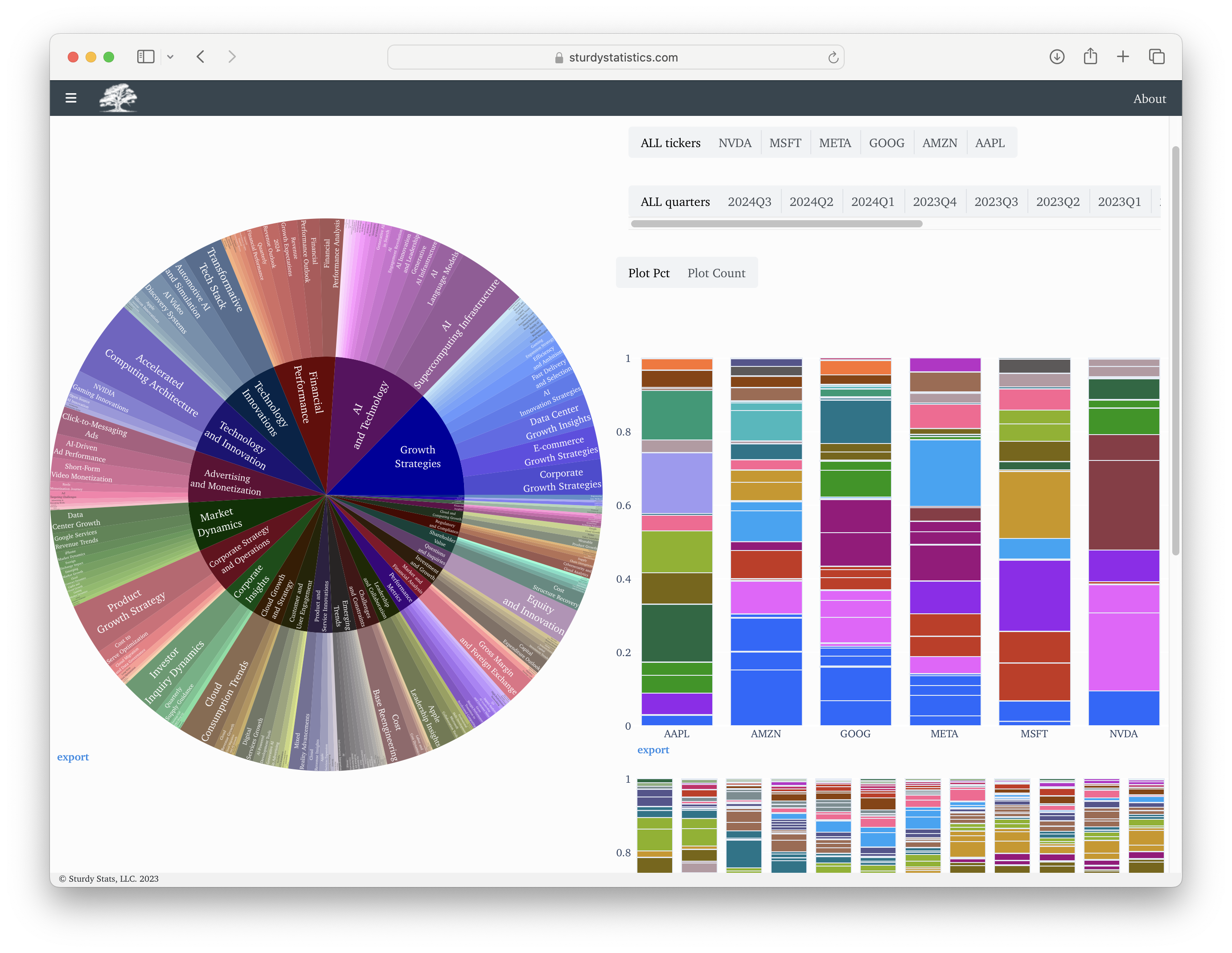
This will open up a page with a search bar and a hierarchical “sunburst” plot showing all the topics identified in the dataset:
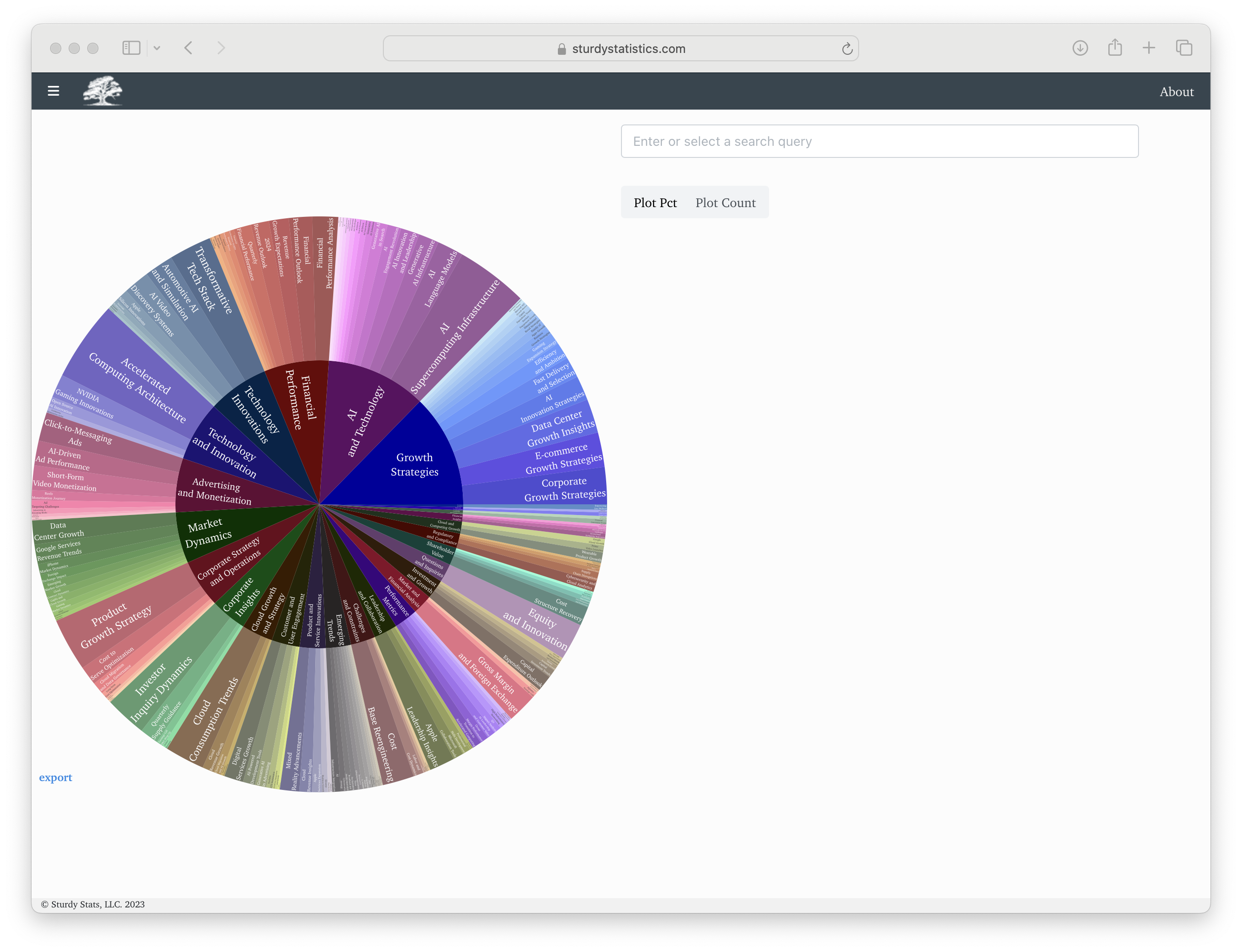
The sunburst plot directly shows the taxonomy of topics that Sturdy Stats has learned from the data. These topics can in turn be used to organize and search all of your data. Clicking on any topic will produce a summary of that topic, and will pull up examples where documents feature that topic. In this case, we first clicked on the group (inner ring) “Cloud Growth and Strategy” and then clicked on the topic (outer ring) “Cloud Revenue Growth.”
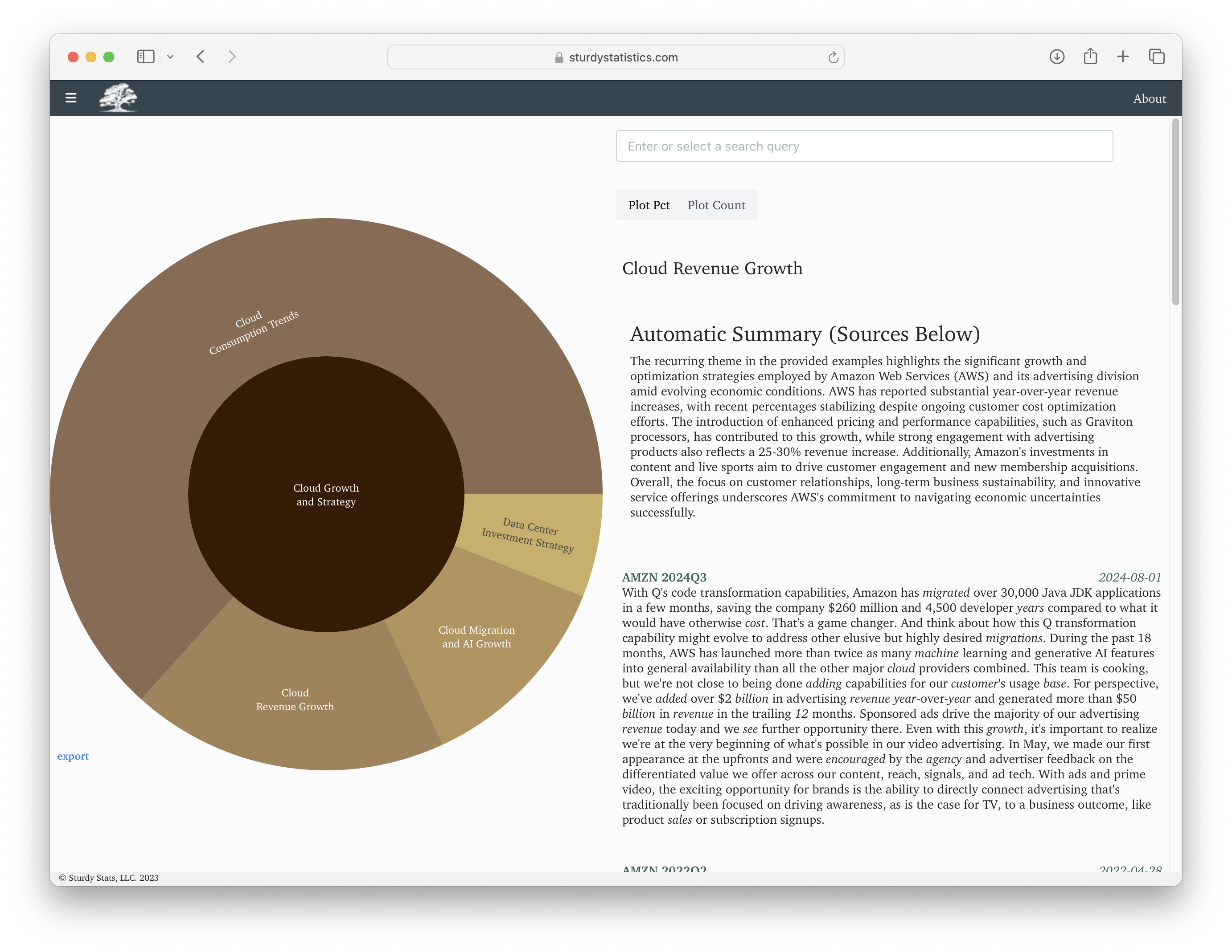
In each example, the words pertinent to the topic are marked with italics. If the document contains metadata fields for title or published, they will be shown above the excerpt.
When you click on a topic, you are directly interacting with the document structure automatically identified by the Sturdy Stats model. Rather than working with the low-level data, you can instead use the search bar:
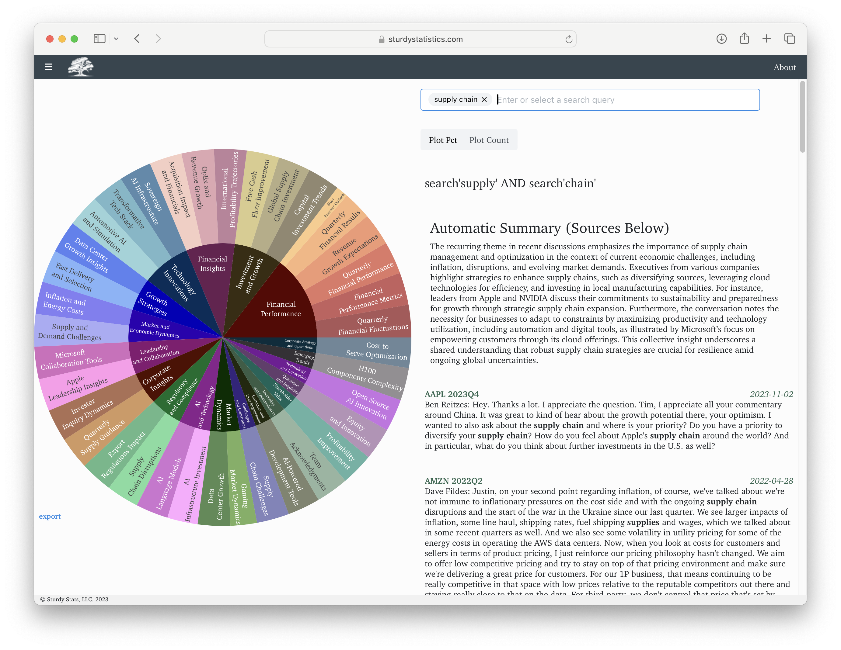
When you enter a search query, the page identifies which topics correlate with the search. The sunburst plot updates to reflect this subset of topics. We also retrieve documents which match your query (using both the search terms and the topical information), and excerpt the most pertinent parts of each document. And we provide an automatic summary of how your search term relates to the dataset. The search allows both AND and OR combinations.
Our dashboard page provides an easy way to explore your data. If you like, however, you can easily make this sort of visualization for yourself; check out our quickstart notebook to build the basics in under ten minutes.
“Comparison” UI
It’s great to be able to explore your data so easily. However, you can do a lot more with our automatically-structured data than just list the topics! If your dataset included metadata, one thing you can do is to see which topics associate with different metadata values. (For more information about metadata, see our upload walkthrough notebook.) The comp_fields URL parameter allows you to do just that type of analysis.
      https://sturdystatistics.com/analyze
      ?index_id=(your index ID)
      &API_key=(your API key)
      &comp_fields=(comma-separated list of metadata keys)
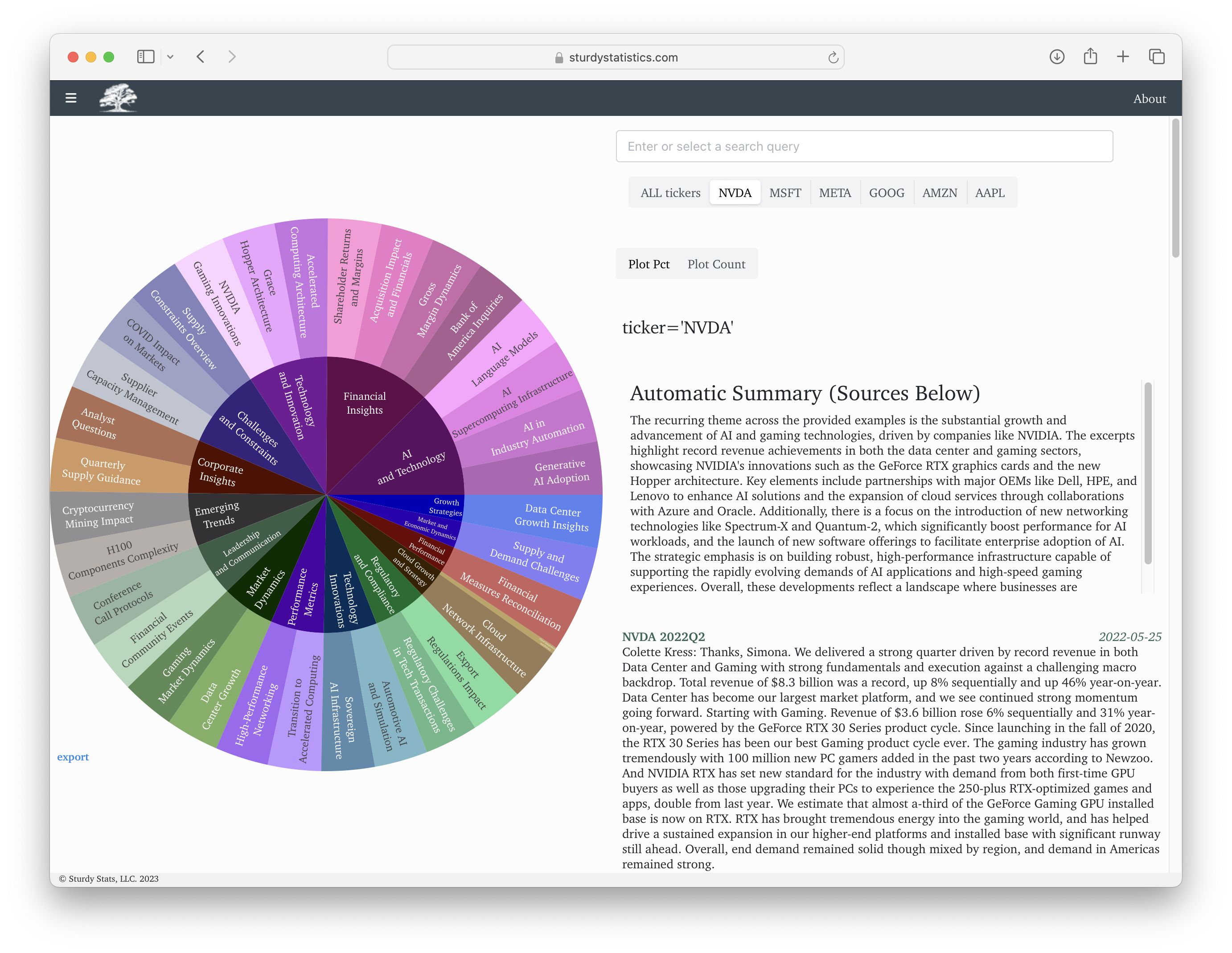
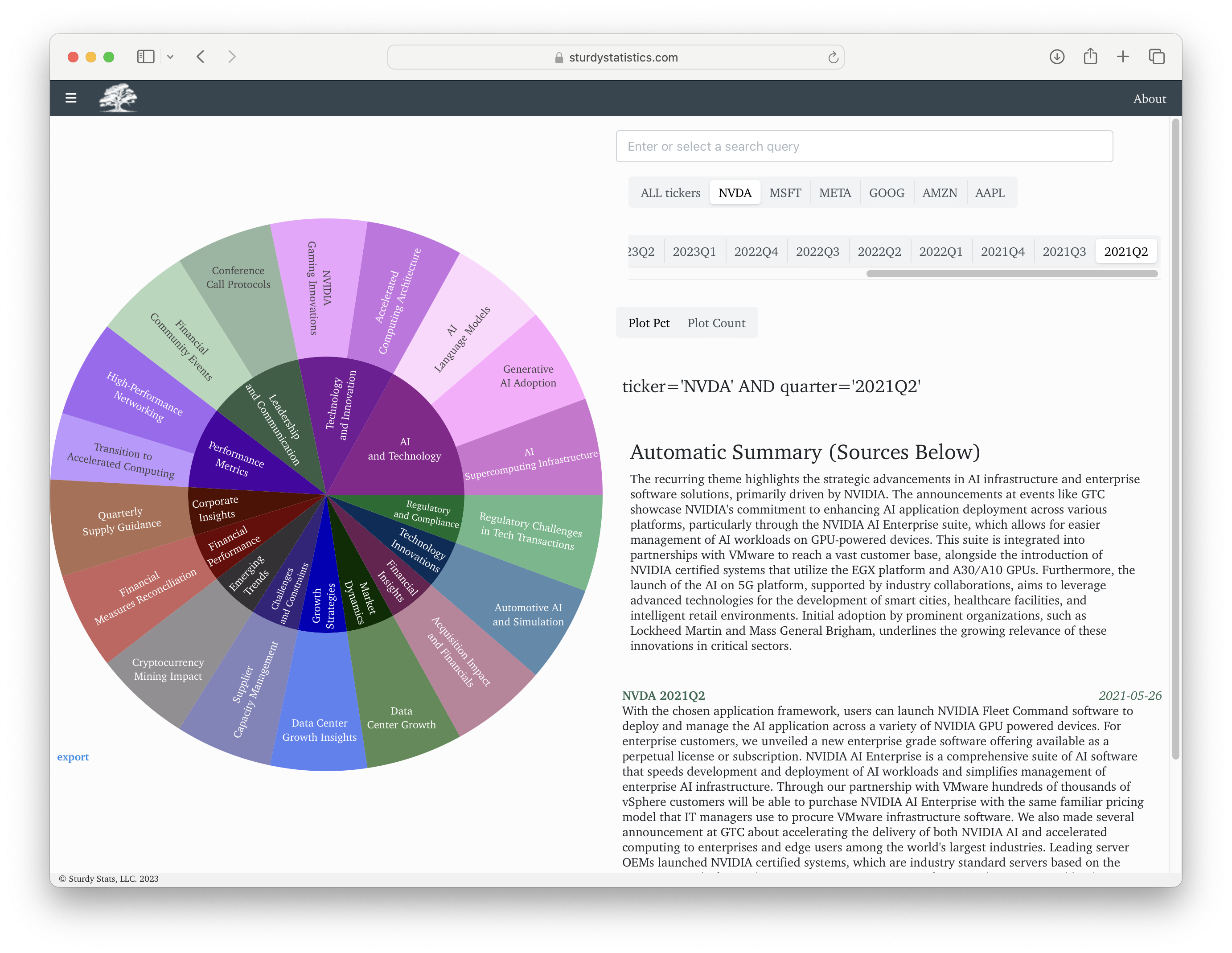
Under the hood, this parameter uses our powerful TopicDiff API. The website now shows a selector for each metadata field. Clicking on any value runs a TopicDiff and the sunburst now shows the topics which are most distinctive of that metadata value. The page also shows the SQL filter used for the TopicDiff, and a new summary is generated describing these distinguishing topics.
In this example, we have set comp_fields=ticker for company stock tickers, and we have clicked on NVDA to see what is most distinctive of Nvidia.
The comp_fields parameter accepts a comma-separated list. If we give it the value ticker,quarter we can refine topics by either ticker, or quarter, or both:
Note that the SQL filter used to construct the query now features both fields. And as before, you can also use the search bar, or you can click on individual topics or topic groups to further refine your results.
These features work by running SQL filters on your data; if you use our API, you can operate on the data easily and in any way you see fit.
Multi-Comparison, or “Bar Plot” UI
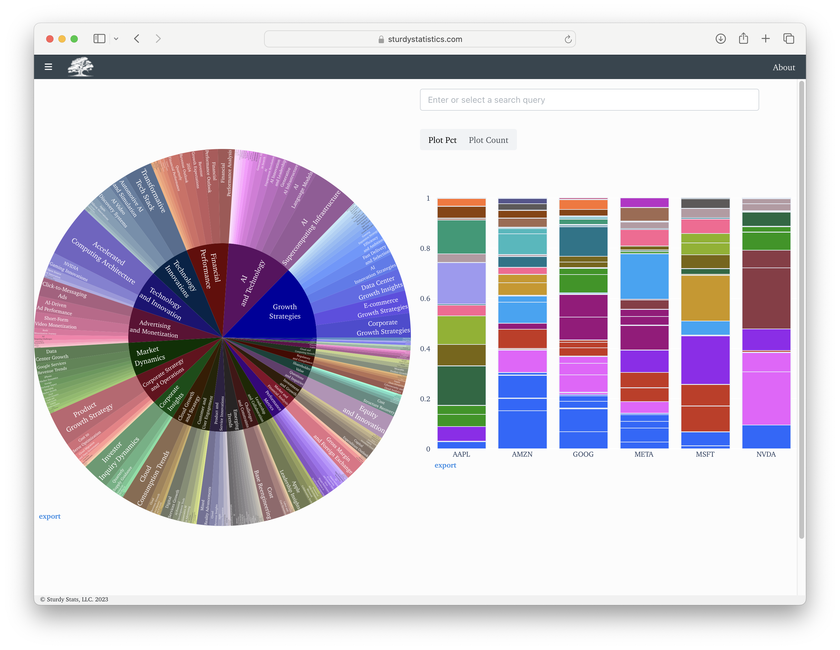
The comparison UI allows you to see which topics are most distinctive to any particular metadata value. The “bar plot” UI performs this analysis for all of the values simultaneously.
Like the comp_fields parameter, the URL parameter bar_plot_fields accepts a comma-separated list of metadata fields.
      https://sturdystatistics.com/analyze
      ?index_id=(your index ID)
      &API_key=(your API key)
      &bar_plot_fields=(comma-separated list of metadata keys)
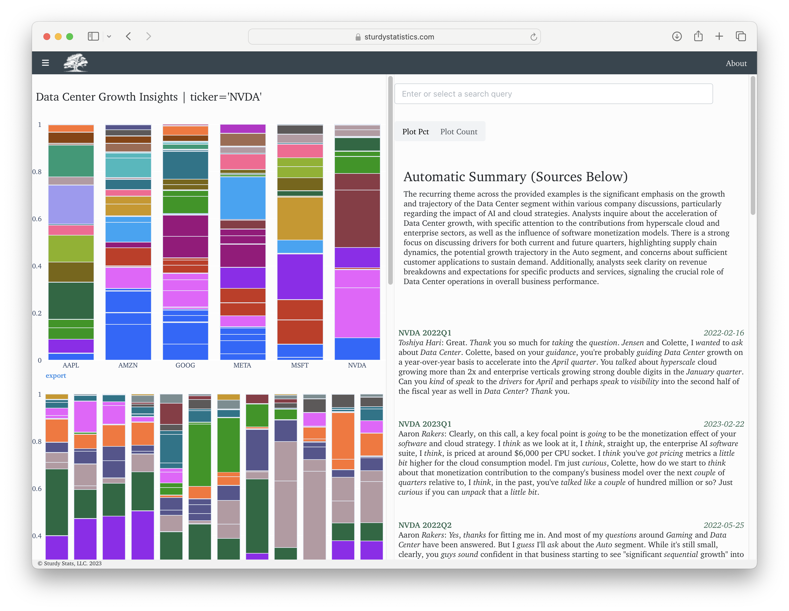
For each metadata field supplied, the page will show a bar plot. Each bar represents a distinct value found in that metadata field, and the bars show the proportion of words corresponding to each topic. (You can toggle between showing proportions and counts with the “Plot Pct/Plot Count” button above the plot.)
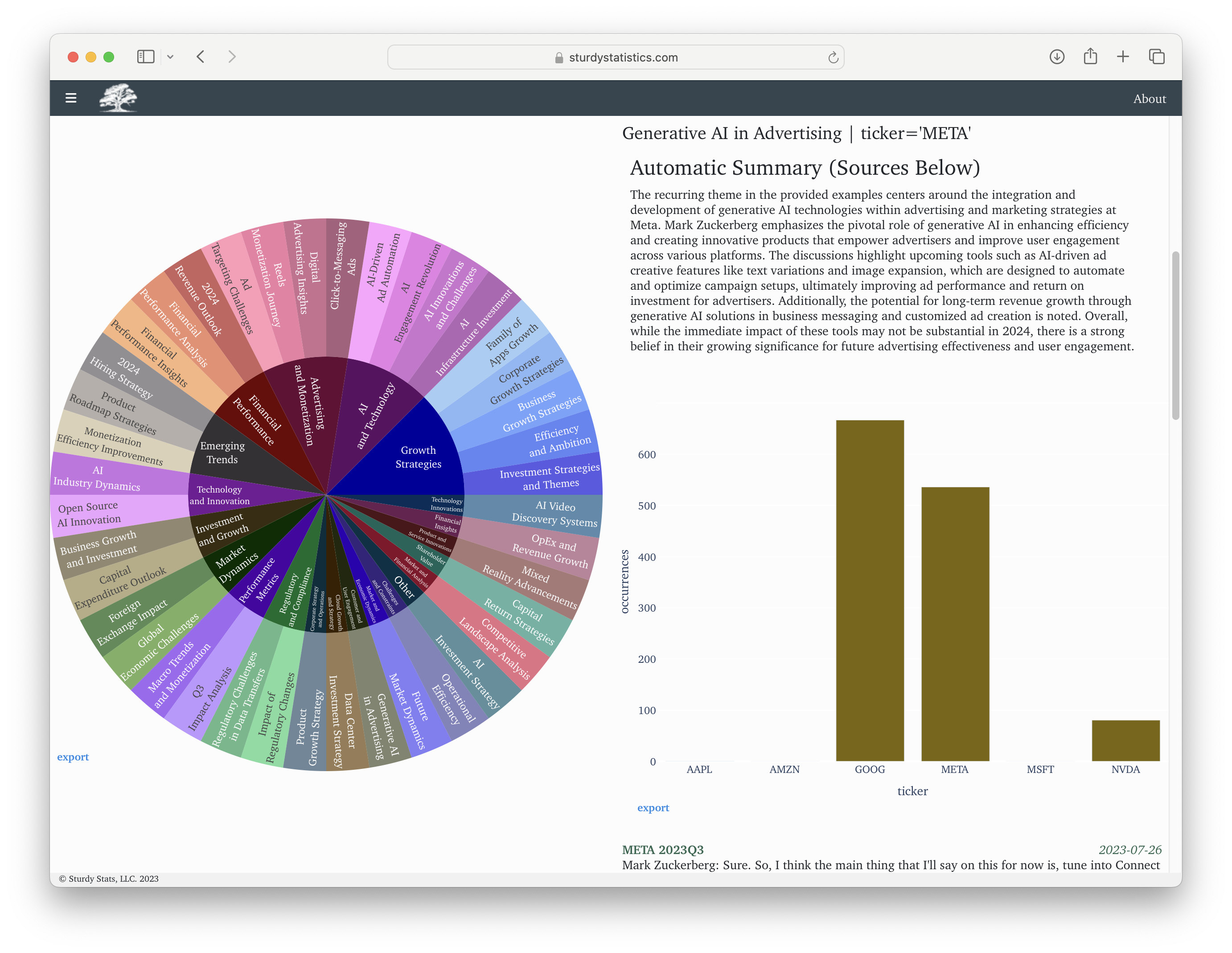
Clicking on a topic will produce a summary of that topic, and will pull up examples. Here we clicked on the topic “Generative AI in Advertising” on the plot for META. Note how the SQL filter updates to reflect both keys, and the sunburst plot and the summary both update to reflect the new filter.
Clicking on a topic also produces a new plot showing how this topic distributes across metadata values:
If you specify multiple bar plot fields, and click on topics in more than one plot, the resulting SQL expressions combine with AND clauses. Each plot relaxes the filter along its x-axis, if present. In effect, this performs a univariate analysis of your data along each specified dimension.
barmode
The barplot UI also has an option barmode=simple, which processes the data in a different way. Rather than running a separate TopicDiff for each metadata value, the page instead runs the SQL filter specified by other features on the page, splits the results by the metadata field, and tallies each topic occurrence for each value of the metadata.
In other words, with barmode=simple the plot shows which topics are present for each value of the metadata, not necessarily which topics are most distinctive of it.
“Temporal Comparison” UI
The comparison and barplot UIs are appropriate for metadata containing a few discrete values. Continuous data like timestamps or dates should be handled differently. For this reason, we have another URL parameter date_field. This parameter accepts a single metadata field, and instead of a discrete selector, it displays a date range picker.
      https://sturdystatistics.com/analyze
      ?index_id=(your index ID)
      &API_key=(your API key)
      &date_field=(single metadata key)
The page bins your selection into a sensible number of intervals, then converts each interval into a SQL filter and runs a TopicDiff, precisely as the barplot UI does.
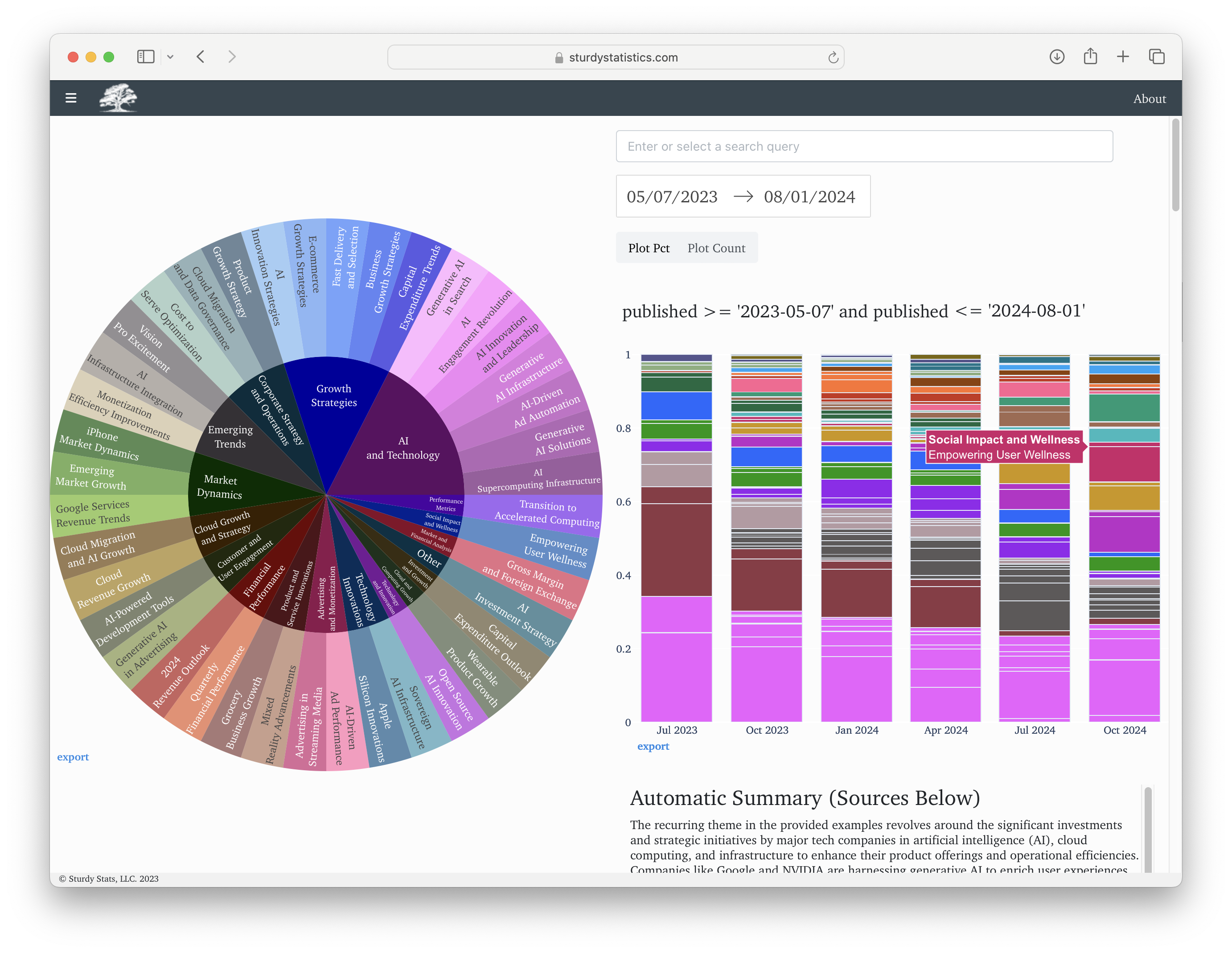
While we only support one date_field parameter at a time, it can be combined with any number of comp_fields and bar_plot_fields parameters.
Combining Features
Since all of the features on this page work by generating SQL filters, they can all be chained together. Thus, you can easily produce a full-featured app for exploring whichever aspects of your data that you want to highlight. The bar plots allow you to see how each metadata field affects the content, effectively performing a univariate analysis along each dimension of your data. Clicking on any topic, in any plot, updates the SQL filter and automatically updates all the other plots.
Whatever your filter is, the page shows excerpts from your data relevant to the filter. The excerpts are exact quotes from the original text, with no possibility of hallucination. And the page also shows an automatic summary of those excerpts. This dynamic experience allows you to follow your nose through the data, finding insights wherever anything stands out to you.
“Quantitative” UI
For more analytical workflows, we provide an option sb=false, which disables the sunburst plot and moves the bar plots to the left-hand column. This features the excerpts more prominently, putting your data front and center in the UI.
These options should help you get started diving into your own data. Our page is open source, so you’re welcome to adapt it to your needs and incorporate it into your own product. And if you want to check out our public indices, we keep a list of them here.